
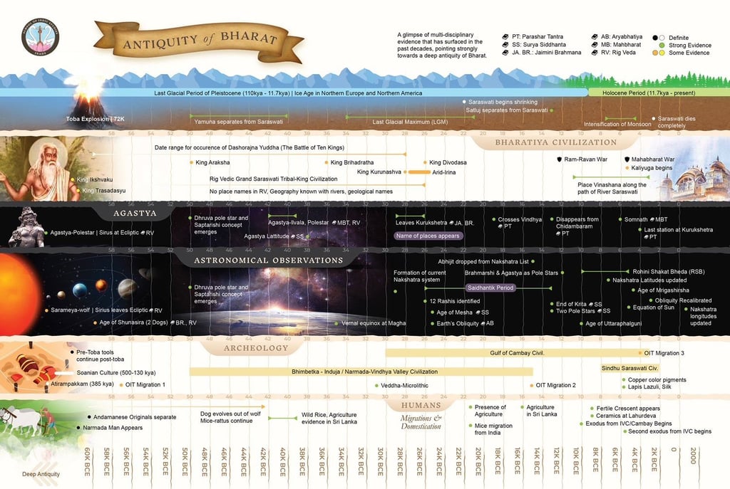
Bharatiya Antiquity Map
Reimagined infographic mapping the timeline of Bharat’s civilizational depth. Based on Rupa Bhati’s research and refined in collaboration with Nilesh Oak.
BLOG
From Complexity to Clarity
In the early days of Prachyam, while immersed in the work of Nilesh Oak, I was introduced by him to another powerful voice in the Indic research ecosystem—Rupa Bhati. Her work on civilizational timelines, continuity, and the distortion of Indian history immediately stood out for its boldness, originality, and depth.
Among her contributions was a detailed infographic chart that attempted to compress the historical, archaeological, and scriptural data into a unified civilizational timeline. While intellectually robust, I noticed the visual structure made it hard for laypeople to fully absorb its significance.
Redesigning the Past
So I took it upon myself—as a personal side project—to reimagine this chart. The goal was to retain the research integrity while making the format more intuitive, scannable, and widely usable. Working closely with Rupa Bhati, and under the guidance of Nilesh Oak (who provided critical feedback for accuracy and clarity), I redesigned the graphic from scratch.
The result is now a widely shared timeline that helps audiences—especially younger minds—grasp the depth of India’s antiquity based on layered evidence: astronomical, archaeological, textual, and epigraphic.
A Quiet Contribution
The redesigned chart was later picked up as a center spread in MyIndMakers’ annual publication, further validating its resonance. But for me, it remains one of those deeply fulfilling projects—born not from briefs or budgets, but from the desire to help powerful research find its rightful voice.
It’s a small effort in the grand narrative, but one that reflects what I’ve always believed: Good storytelling can make great knowledge travel farther.
Kshitiz Rai © 2025
A multimedia storyteller following his curiosity in the Indic knowledge space.